
Designing Bib & Tucker's responsive shopping experience
Case study for a clothing retailer

Project Type
Responsive ecommerce website
Role
Research, UX/UI Design, Branding
Duration
Four weeks (2020)
Project completed for Designlab UX Academy

With over 400 successful brick and mortar stores in 32 countries, Bib & Tucker targets consumers looking for quality clothing at an affordable price. Their customers have been asking for the ability to browse and purchase online, and they recognize that this is a big market opportunity they could be missing out on.
Millennial and GenX shoppers with a large amount of spending power are increasingly moving to online shopping, and Bib & Tucker wants to meet them there. In order to reach more people and provide extra convenience, my task was to create a responsive eCommerce site and solve the following problem:
How can we create an engaging shopping experience without common retail pain points?
Research
My main goals were to understand the strengths and weaknesses of the online fashion market, learn about the habits of shoppers, and identify motivations for customers purchasing online vs in-store.
Speaking with shoppers
My primary research was conducted through remote interviews with people who shop online regularly. I asked about their experiences shopping in person and online, and some of the benefits or pain points that go along with those experiences. Through this I was able to uncover the needs, wants, and opportunities for the user. Here are some of the questions I asked:
How do you typically shop for clothing online? What about in-person?
Tell me about an enjoyable experience you had shopping in-person. What about online?
What frustrates you about shopping in-person?
What frustrates you about shopping online?
What ecommerce websites are most appealing to you? Why? Least appealing?
Customers wanted many of the same things:
Users need the ability to quickly find a specific item
Users need a site or mobile store to work, period.
Users need full transparency on what they are buying
Users want good customer service
Users want reviews
Users want companies that are mindful about ethics and/or sustainability.

Assessing the competition
I assessed key retailers in the fashion industry to identify their strengths and weaknesses, both in business practices and in their website usability. Analyzing the design of popular sites helped me uncover common patterns to help direct the design of Bib & Tucker.
I found some interesting insights and useful opportunities:
All major players have strong product organization, search, and filtering on their sites. Product photos and descriptions are generally well-done.
Opportunity for improved sizing guide
Opportunity for richer reviews and/or to build a community around reviews
Opportunity to use online and physical stores in tandem for a cohesive shopping experience
Define
In order to understand what I needed to design, I needed to fully understand the user. I took a linear approach and completed each step of this process in order, which works best for me. By creating a persona, considering the structure of B&T products, and thinking about how a user moves through the system to complete various tasks, I was able to get a clearer picture of what the site should DO for the user. I also had to consider B&T’s company goals to be sure that I was achieving harmony between the needs of the company and their customers.
Inside the mind of the user
Click to enlarge
Where do all these links go?
How should I organize the site? Competitive analysis was very helpful here. Creating a site map helped me define how the site would be organized, and look for ways to implement the features that I found were important to customers.
Considering all outcomes
What will it be like to use the site? User flows helped me define the experience for the user, and to avoid confusing navigation and how to prioritize what actions are on each screen. My empathy mapping exercise helped to define a user flow that gave confidence and control.
Keeping my priorities straight
Considering the common goals between Bib & Tucker and its users helped me to keep my priorities focused on a limited budget of time.

Design
I began sketching just the homepage, since it is the most-visited page, and since it shapes the priorities for the rest of the site. Testing would later help confirm or challenge my instincts on the placement or sizing of certain elements. I included interaction notes to demonstrate functionality that could not be drawn.
Getting ideas out quickly
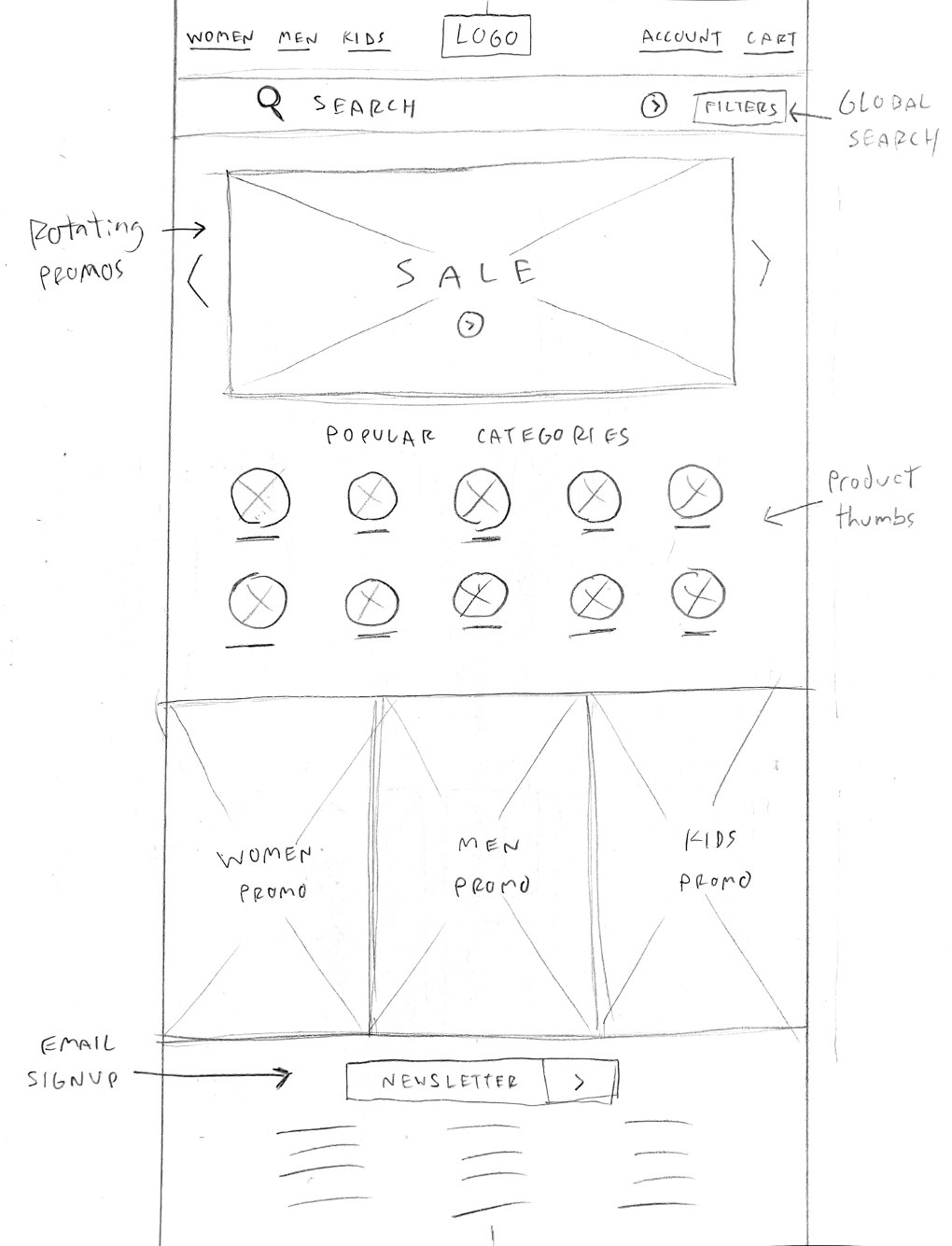
This version pulls out popular categories instead of burying them in the main navigation. Search is emphasized. Inspiration for this version came from furniture ecommerce sites.
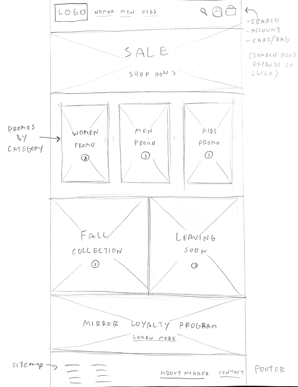
More compact global header to make room for main and secondary promotions. Large, lifestyle-oriented photography.
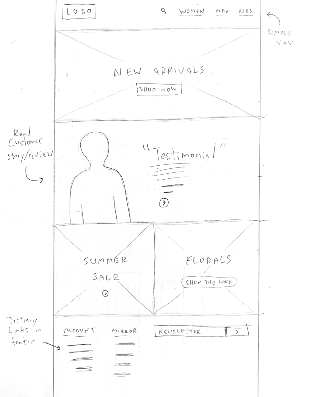
An evolution of the previous version, this concept places an emphasis on customers, reviews, and community.
Blocking out pages
Sketching helped map out my instinctual ideas. Lo-fidelity wireframes started to put those to the test, and helped me block out sections, elements, and typography. This is where I started to work with a grid system and make considerations for more key pages. I also built a prototype to test drive how these pages would work together, and if the buttons and navigation were behaving as I would expect. This was all a rough process, but it helped shape the final designs.
Homepage - click to enlarge
Browse - click to enlarge
Product detail - click to enlarge
Creating a brand
In the rough and tumble days of early America, the term “bib & tucker” was used to describe your finest attire; what you would wear to a fancy party, dance, or wedding. Because no visual cue would probably work to represent this concept, I chose to use a logotype instead. Writing down brand adjectives based on what I already knew about the company helped me sketch out logo and mark ideas, and later helped with font and color choices. Finally, considerations were made for the UI of the site, such as headers, body copy, link colors, and more.
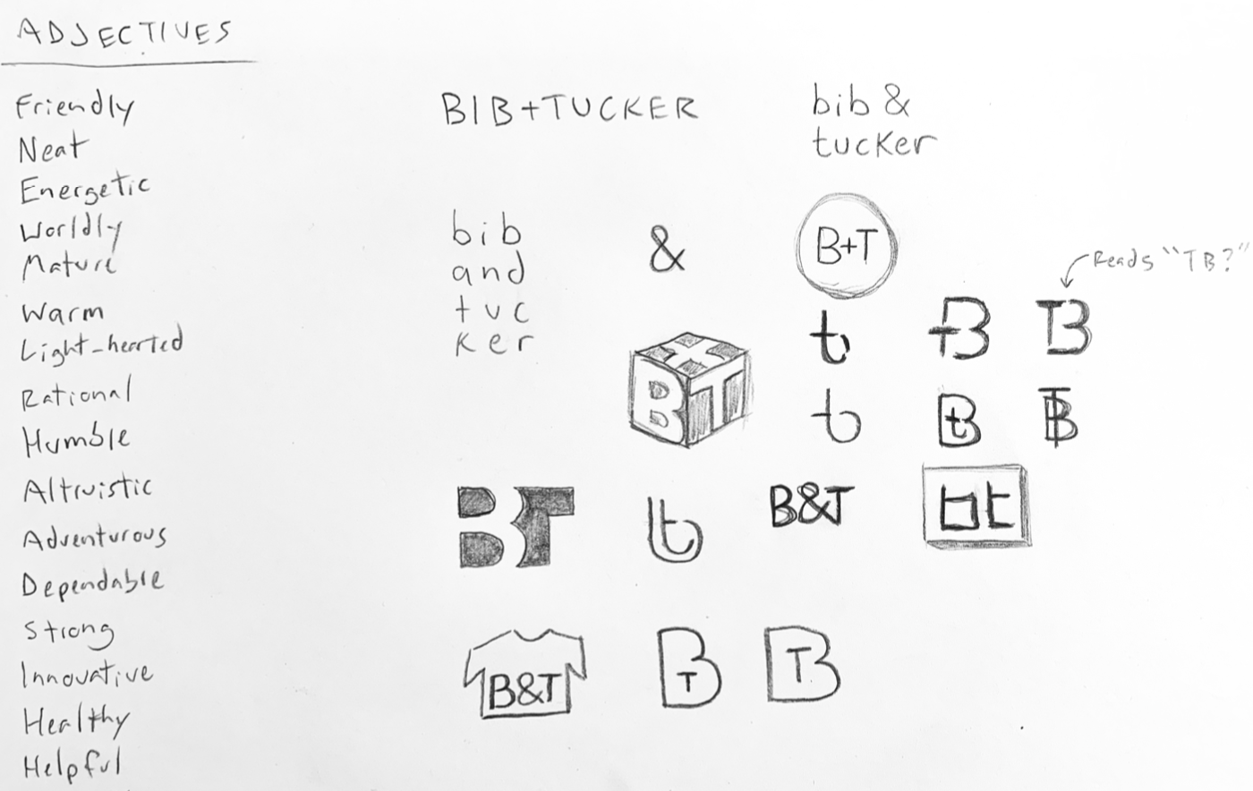
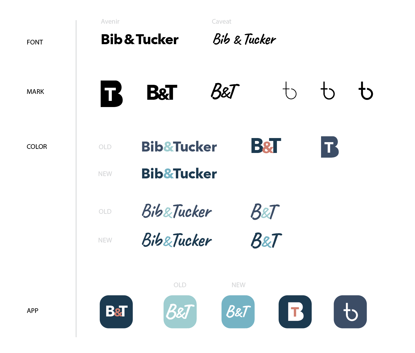

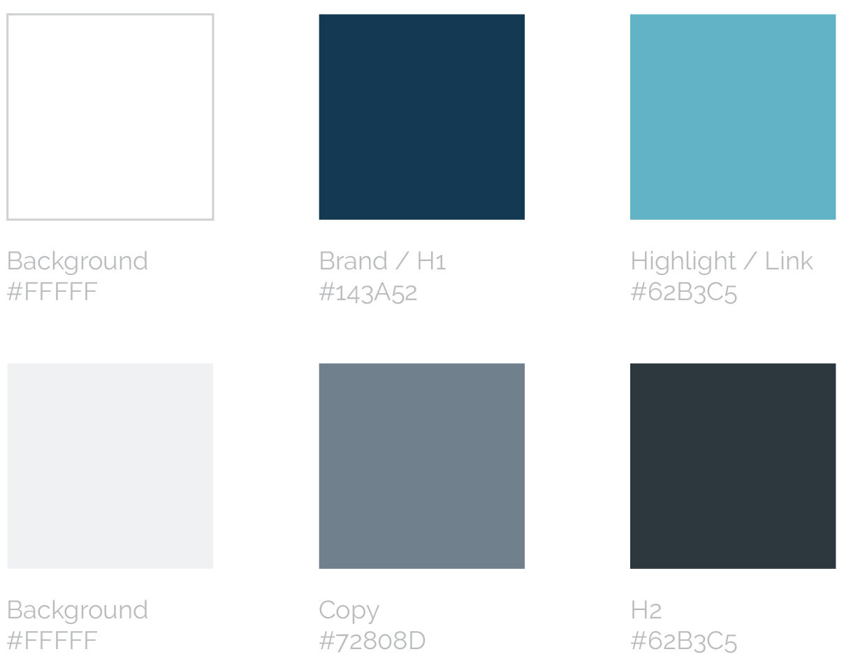


Going high-fidelity
I applied my branding to my wireframes and paired it with dynamic imagery and typography to reflect Bib & Tucker’s brand personality. I completed compositions in desktop, tablet, and mobile sizes, and considered how elements on the page rearrange depending on the viewport. Design was completed in Figma using desktop and iPhone 8 display dimensions.

Homepage prioritizes sales and promotions, as well as social connection and their loyalty program.
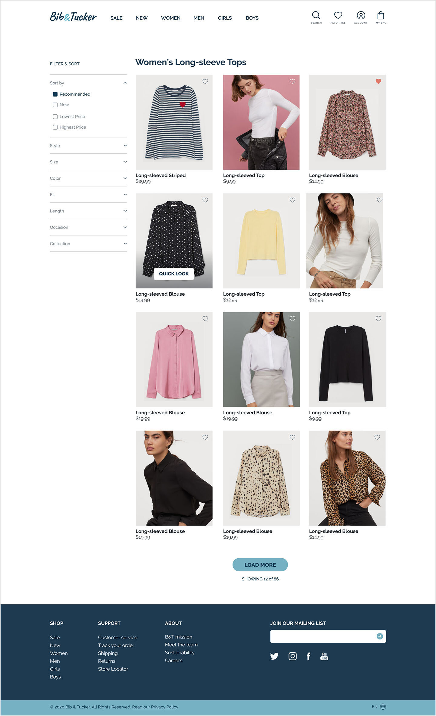
Product Browsing puts items front and center, and gives the user maximum control of their browsing experience with filters and view options.
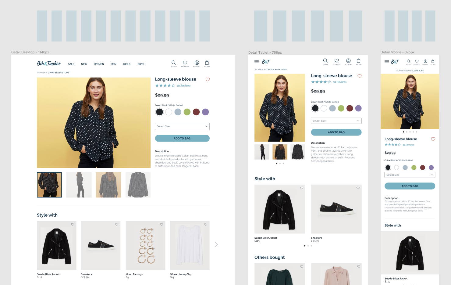
Responsive designs for the product detail page show how elements scale for desktop, tablet, and mobile.
Testing
The easiest way for me to test was remotely, using a screen sharing platform and (with permission) recording the results. After each of the three tasks I followed up with additional questions about the users’ experience, expectations, and potential pain points. Using these insights, I made adjustments to my final deliverables to increase their chances of success.
The five participants were female and between 24–34 years old, all falling within the target demographic for the company. Each participant was given a brief introduction to the purpose of the test, and then each scenario and accompanying task was explained one at a time. Total testing time for each participant ranged from 15-20 minutes. Audio and video were captured while the participants shared their screen to demonstrate the tasks:
Task 1 - Find a long sleeve top, select a size, and add it to your shopping bag.
Task 2 - Find a long sleeve top and navigate to the customer reviews.
Task 3 - Find two dresses and add them to your favorites, then view your favorites list.
What happened during testing?
Overall, users found the site easy to understand and navigate. Errors were typically limited to quirks in the prototype. There was some discrepancy on what the person/avatar icon meant in the global nav, so adding text labels to each one would be beneficial.
Streamlining the reviews and their styling could improve the user experience – at least one participant attempted to click on part of the review summary in the review section, even though they don’t lead anywhere. Giving users multiple options to get to reviews will be important, as some are used to different patterns than others.
At least one user expressed an interest in additional product pictures, or a quicklook feature, before they feel comfortable favoriting an item.
Conclusion
I learned from this process that my own assumptions and preferences can be very powerful influencers, and relying on early research, interviews, and testing is crucial to be sure one does not “design for themselves.” This project taught me a few key things:
User flow exercises are a great way to uncover functionality gaps
Interviews and tests can quickly reveal user expectations and preferences
Benchmark, benchmark, benchmark!
The biggest challenge for me was to trust the data and not rely on my own instincts. Overall, I am proud of my design, and I have research to back it up. One thing I plan to do to improve my process in the future is to test more frequently, and especially at the wireframing stage. It will be much easier to iterate on a low-fidelity design earlier in the process, than to try to fix a high-fidelity concept and potentially re-design an entire page.

