Augmented reality shopping app by Heem
Creating a next-gen furniture shopping experience.
Project Type
Mobile iOS App
Role
Research, UX/UI Design, Branding
Duration
Four weeks (2020)
Project completed for Designlab UX Academy

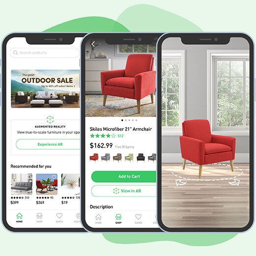
Heem is an app for home design that specializes in augmented reality (AR) shopping. A useful tool especially for furniture, AR allows a user with a camera-equipped mobile device to see a rendering of an object in their own space. Instead of traveling to a store, or guessing what a piece online might look like, they can get a rough estimation before their eyes.
The problem is that AR is not a widely understood or leveraged service, and they risk low adoption if implemented poorly. Even among younger tech-savvy users, it will be important to deliver a familiar shopping experience and a non-intimidating AR experience. For future users of this app, my design challenge was:
How might we empower users with AR in an ecommerce app?
Research
Talking to shoppers
I conducted remote user interviews and asked participants about both their furniture buying habits and experiences with augmented reality. This allowed me to discover motivations, habits, and pain points that contribute to the furniture shopping experience. All of those interviewed had purchased furniture recently. By asking open-ended questions about their experiences, I have identified some needs, wants, and opportunities when considering the design of the Heem app. Some of the questions I asked were:
Tell me about a recent furniture purchase. Where did you begin? What convinced you to finally buy?
Tell me about POSITIVE experiences you have had buying furniture. What made them successful?
Tell me about NEGATIVE experiences you have had buying furniture. What frustrated you?
Tell me about any shopping apps that you use. Why do you like them?
What experiences have you had with augmented reality (AR)?
Based on these interviews, I was able to draw some conclusions:
Users need quality product photos.
Even with AR, users need to know the dimensions of a piece of furniture.
Users want product reviews.
Users want the ability to save favorites and create lists.
Assessing the competition
I downloaded competing furniture apps (IKEA, Wayfair, etc.) to see how they handled the AR shopping experience. Looking at the design and flow of these apps helped me direct the design of Heem’s app. One example, LaZboy AR, is below:
Click to enlarge
The best apps had certain things in common:
Branding is generally minimal, letting the products and photography have highest emphasis.
The apps that offered the most confidence about their AR feature had a robust tutorial or walkthrough.
The most immersive AR experiences had the fewest controls on screen, but sometimes at the cost of usefulness.
My market research uncovered the following:
Research is a large part of a shopper’s buying process.
To convince someone to buy furniture online, extra steps need to be taken to build confidence about color, materials, and size.
Augmented reality is not widespread or fully understood, so extra care may be needed to guide a user through the process.
Define
I needed to get into the head of my users before I could jump into design. I took a linear approach and completed each step of this process in order (I think my brain works best this way). I created a persona from information gathered in my interviews, and placed them inside the customer journey of a typical furniture shopping experience. Doing this allowed me to think through the entire inspiration, browsing, and purchasing process. The journey tracked multiple aspects of a user’s path and presented opportunities for the role of the app in this process.
Click to enlarge
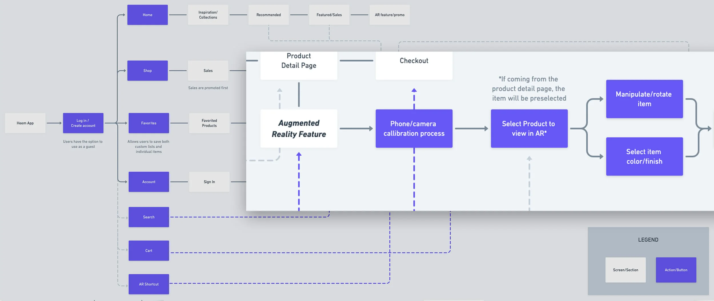
How will a user move through the Heem app? A user flow helped me to plan a user’s path through the AR feature in a way that gave confidence and control. The customer journey helped me identify key moments in the furniture buying process, and to reflect those in the app to be more helpful to the user.
Design
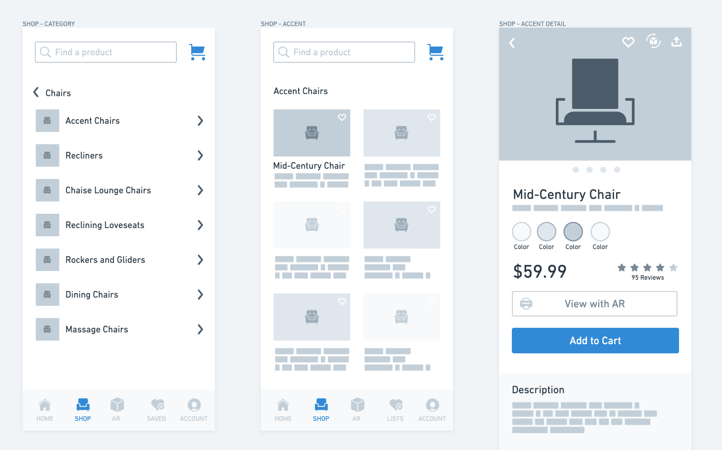
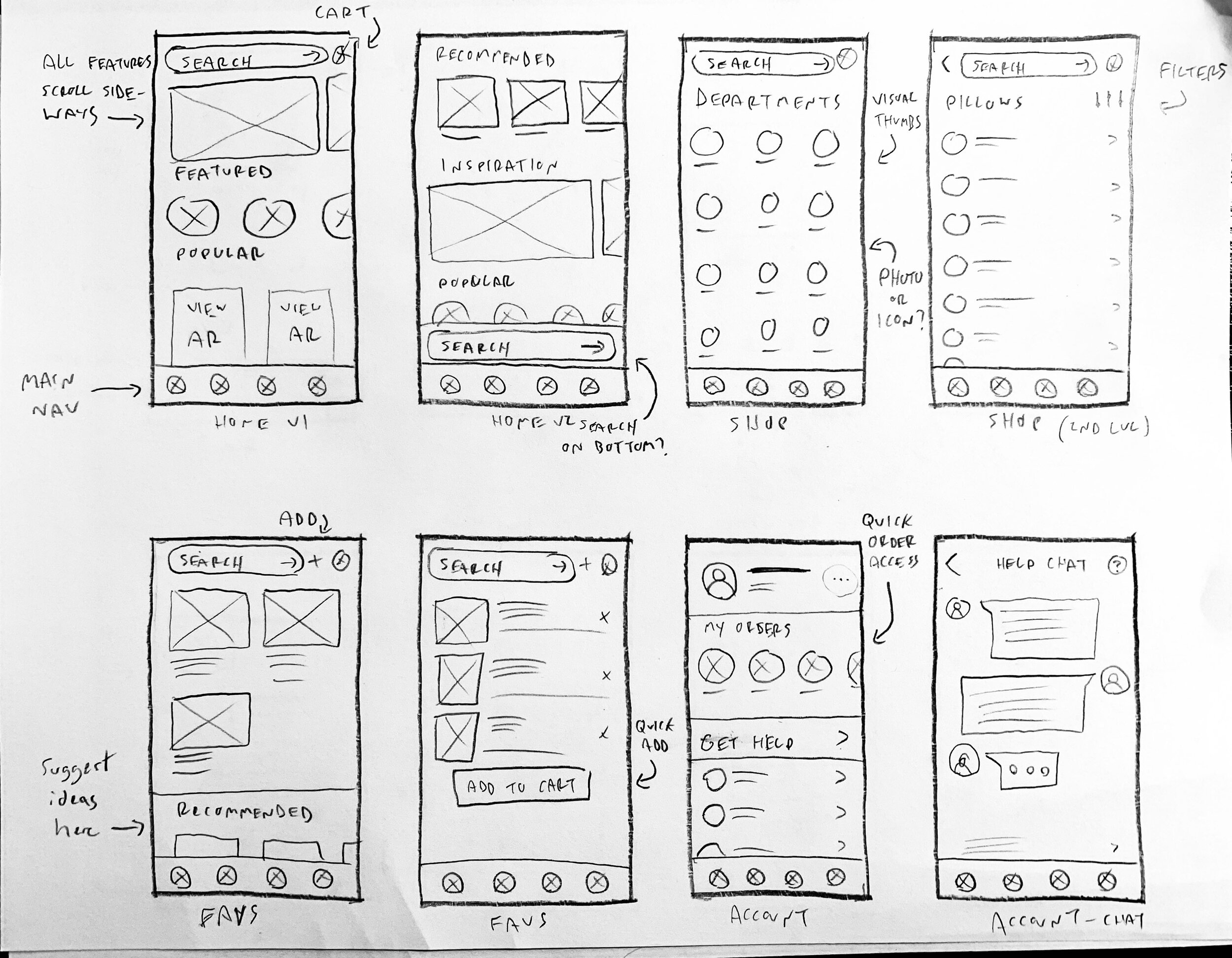
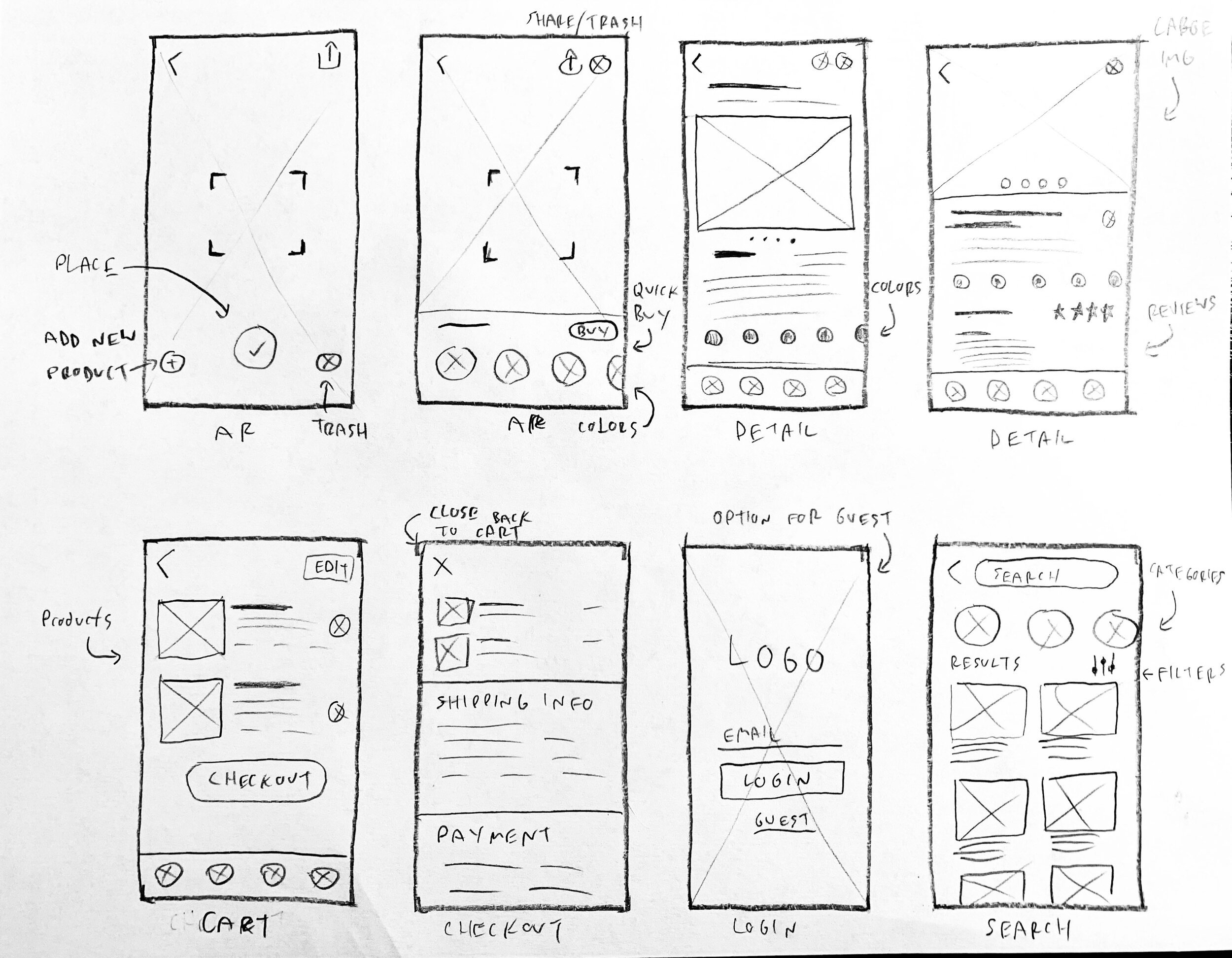
Sketching with pencil and paper helped me to get ideas out quickly. I could rapidly consider the actions a user would take on each screen, and where they could be placed. I included notes to describe functionality that could not be drawn. I included more than one variation of certain screens if I thought there were multiple ways to accomplish the same task. Testing would later help confirm or challenge my instincts.
After benchmarking some other apps, I chose a general design direction from those initial sketches. Building these allowed me to see the actual size of elements on the screen, and to make sure everything had appropriate spacing and visual hierarchy.
Early user testing
I tested my wireframes with users before any final decisions were made. This way I could confirm (or change) how I hypothesized the app will work based on my research. Using remotely-moderated testing, I was able to see how other people used the Heem app (in its rough form) and find opportunities for improvement. I found a handful of willing friends and coworkers to dive into an Invision prototype and give me their honest opinions.
I gave my participants the following tasks:
View a mid-century chair in AR and add to cart
Find reviews on a mid-century chair
Favorite the leather recliner and find it in your favorites
After testing on a few people, patterns started to emerge:
Users utilized the search bar more than expected. It should remain prominent and very easy to use.
“Lists” was a potentially confusing term for the Favorites section (even though it DOES contain lists), and further benchmarking or research is needed.
The AR process may need more explaining and labels for buttons. While potentially more visually obtrusive, it will give users confidence with a relatively novel feature.
Home and Shop tabs should be visually distinctive, since they serve similar purposes.
No one used the dedicated AR link in the main navigation.
Branding Heem
At the outset of this project, Heem carried no branding, just a name. I needed to create a brand that spoke to the broad range of products available, as well as the augmented reality angle. Since no one image or icon could represent the brand, I decided to use a logotype instead of a mark. The typeface is bold and clear, putting the right angles of the capital letters in relationship with the tic marks on the perimeter. These marks represent the reticle of a viewfinder in a typical AR application, and also allude to a floor plan view of a home.
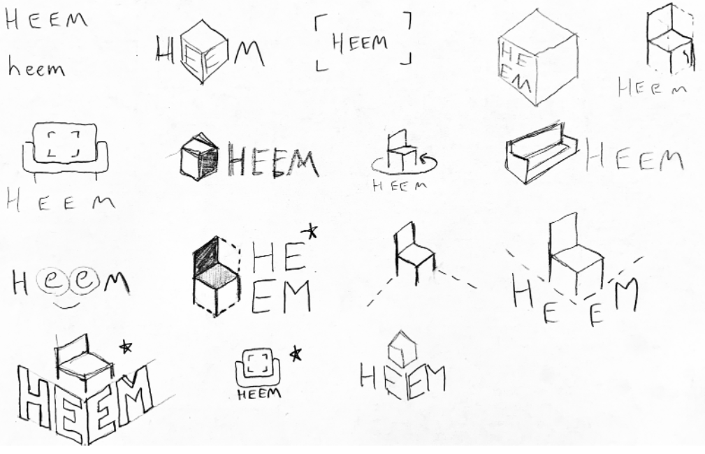
Initial sketches

First round polish

Second round iterations

Final version
Bringing everything to life
After receiving valuable feedback from my testers, I made some changes. I then brought the app to life with imagery, icons, and splashes of brand color. I made choices that let the images be prominent, and the UI was made to be unobtrusive. Links or actionable items are clearly distinguished with the brand green. Design was completed in Figma using iPhone X display dimensions.
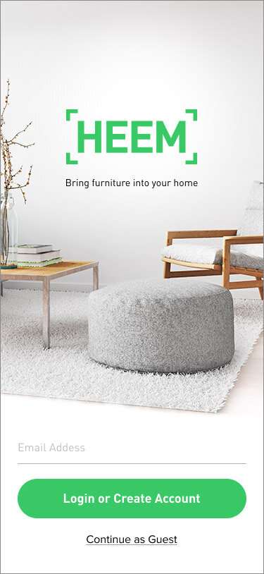
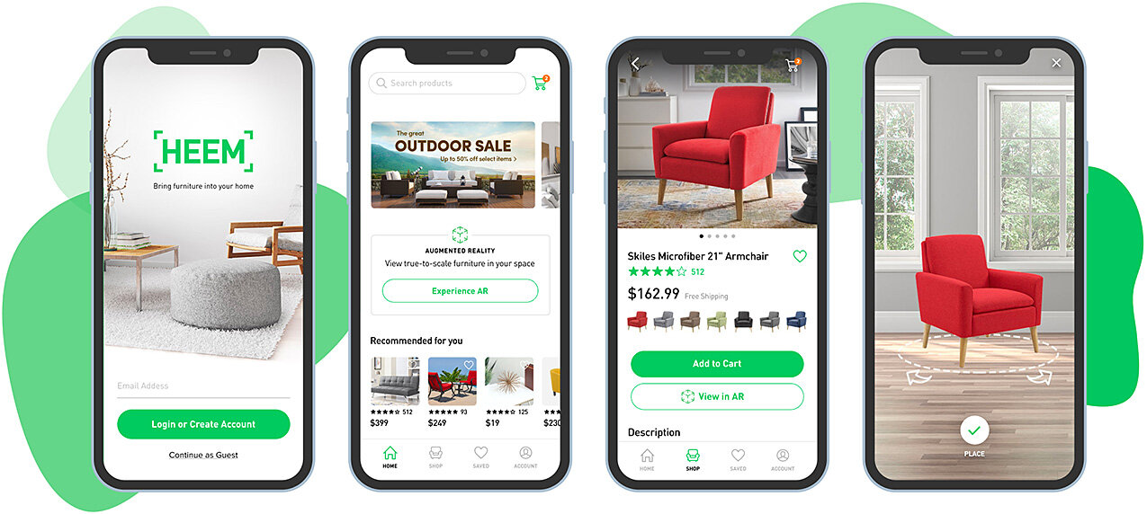
Login screen
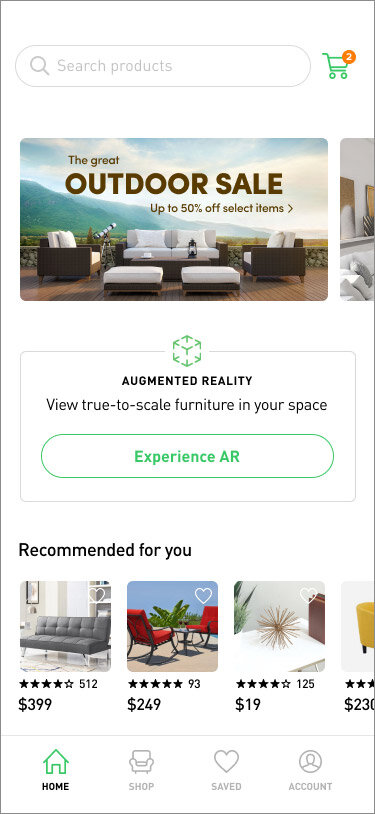
Home screen promotes search, the AR experience, and personalized recommendations based on shopping history.
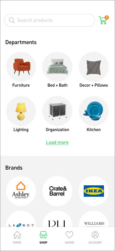
The Shop screen shows both popular categories and brands.
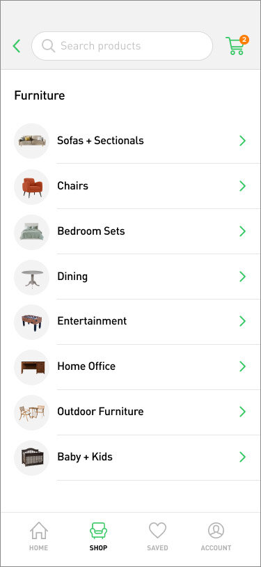
Furniture is further organized by type and given a visual cue to ease the mental load on the user.
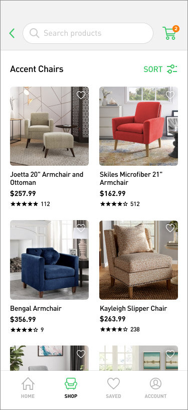
Products are pre-sorted but allow easy access to filters. Price and ratings are prioritized.
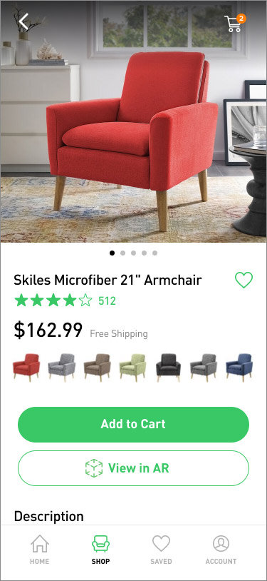
On the product detail page, photos are front and center. Options to add to cart or view in AR are viewable without scrolling.
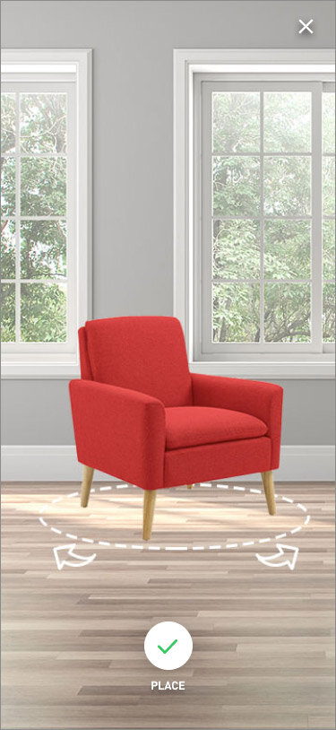
The AR experience guides the user to place the item in their space.
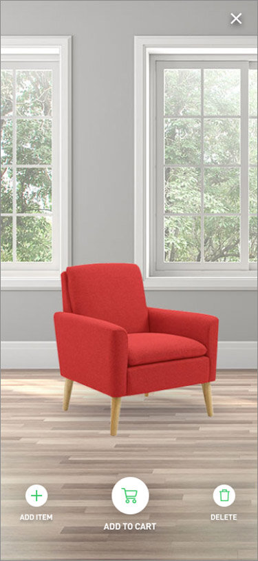
Once placed, the user can add additional items, tap to modify, or add to their cart.
Testing
After the high fidelity designs were complete, it was time to test them. I created an interactive prototype using Figma, created tasks for users to complete, and received feedback with remotely-moderated sessions. The tasks were:
Task 1: Look in the furniture department for an accent chair under $200 and find the reviews.
Task 2: View the accent chair you found in augmented reality and add it to your cart.
Task 3: Browse the recliners section and save the Winston Porter recliner. Then go view it in your saved items.
What happened during testing?
Test subjects found the app easy to navigate, and overall well-designed.
Interestingly, every person went to the “accent chair” shortcut on the homescreen, instead of searching or using the Shop tab. This was partly a coincidence of instruction for testing, but shows that links to popular items on the homesceen would prove useful.
When asked to find a chair at a certain price point, every person attempted to use the sorting/filtering option. This confirms that it should remain prominent and accessible.
Most users agreed that the AR experience was straightforward, even with the limitations of the prototype, but that a basic walkthrough or skippable tutorial would be useful to give extra confidence.
Making improvements
Based on my user feedback from testing, I made a few UI changes to the app, along with a more guided approach to the AR experience for a first-time user. These improvements should improve the user experience, but more rounds of testing would help to refine the experience even further. It’s an evolving process and one that’s never truly complete. The changes implemented below represent some of the most impactful changes given my constraints.
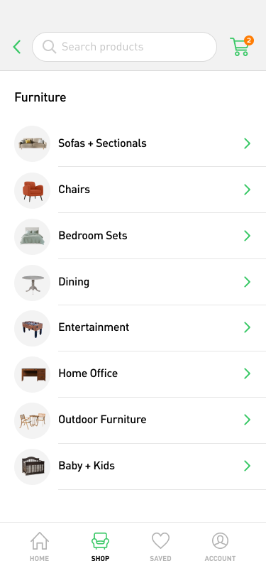
Search and navigation - One common recommendation was to make the search and shopping cart fixed at the top of the device screen. In order to do this, I had to make a change to the design to include the “back” button in the grey field. I made this field shorter so that when a user scrolls less of the screen is blocked.
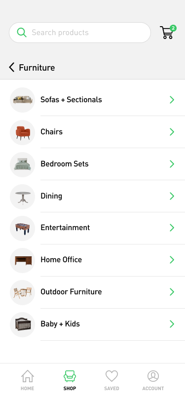
Before
After
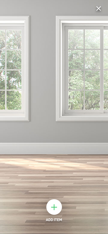
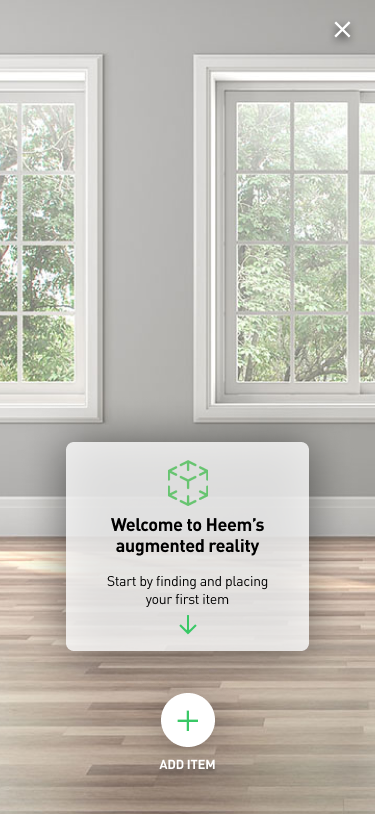
AR walkthrough - Through testing, I found that most users agreed that the AR experience was straightforward, even with the limitations of the prototype, but that a basic walkthrough or skippable tutorial would be useful to give extra confidence. Have an explicit walkthrough to demonstrate how the feature works will help give users more confidence when they use the feature, and could be programmed to only appear on the first experience.
Before
After
Conclusion
Implementing augmented reality in an easy-to-use way presented some challenges. Promoting it on the homescreen and product detail pages struck a good balance of user awareness of the feature without getting in the way. The experience itself was made easy to follow and should give even novice users confidence.
My favorite part of this project was getting to design an experience that I would want to use myself (especially since I have purchased furniture through similar services before). Ensuring I was not designing for myself, this project reinforced the importance of testing in early (wireframe) stages, as well as benchmarking other successful applications. While there are further improvements I would make with the proper time, I believe this would be a good way to bring a next-gen shopping experience to the public.
