Sentiment Analysis Proof of Concepts
In order to better understand its customers and the service they receive, this major West Coast utility (name redacted) explored the use of sentiment analysis across different parts of their organization. These solutions included analyzing social media activity to more quickly and effectively respond to emergencies like wildfires, as well as the ability to determine how a caller felt about their experience getting help from an agent.
They needed rapid proof of concepts, and working as the solo UX/UI designer on the project I collaborated closely with product owners, engineers, and client stakeholders. Working in one-week sprints, I performed competitive analysis and user interviews to gather requirements. I then built wireframes, high-fidelity designs, and interaction notes for development handoff. I also led group design reviews along the way to gather feedback and iterate quickly.
While some of these proof of concepts will see the light of day and others won’t, they are each a case study in my UX process and ability to collaborate across teams.
Considering the user
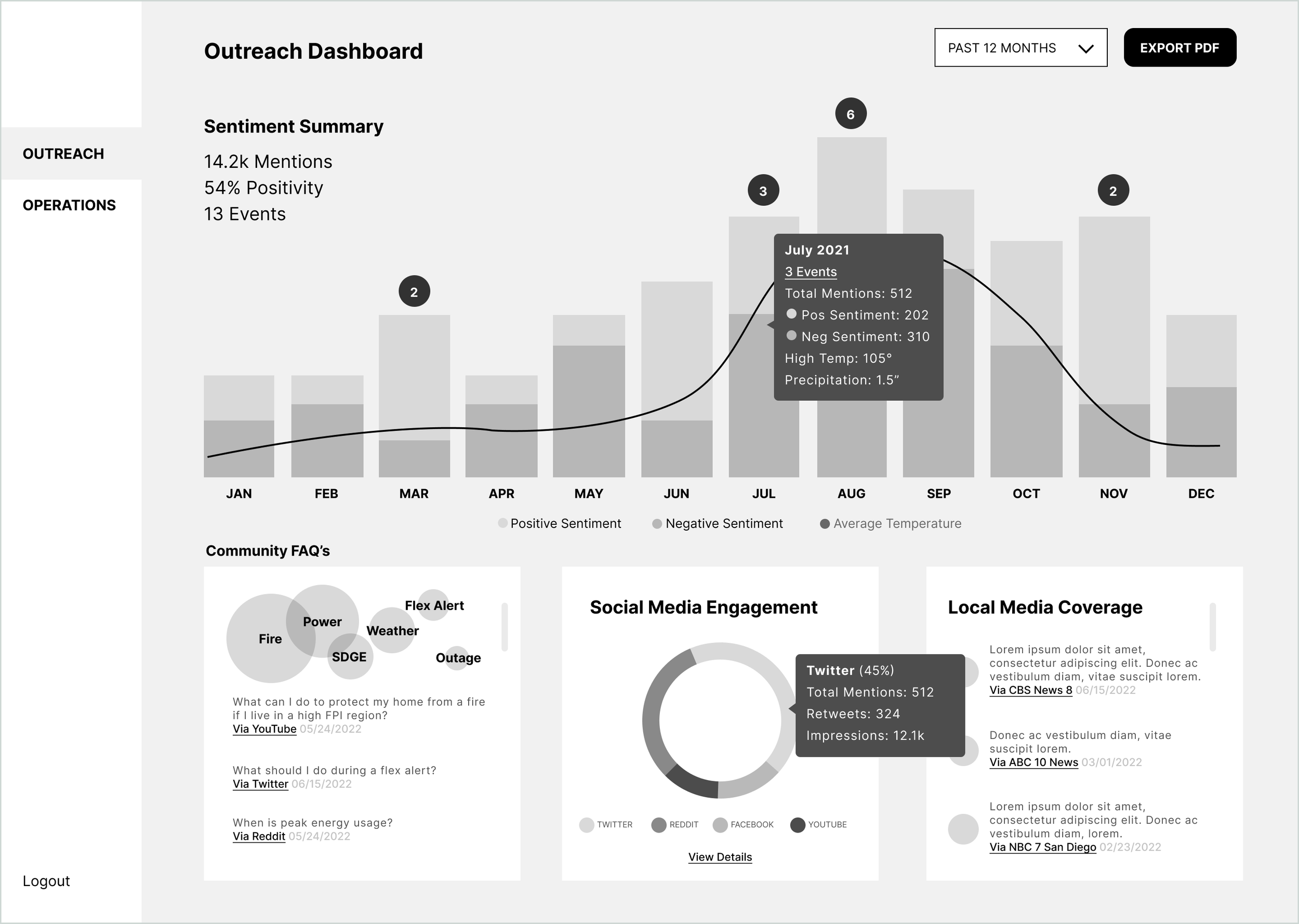
This landing page dashboard helps frame what information is most important to the user at a glance.
How was your experience?
This high-fidelity concept breaks down the feelings of both the caller and an agent in a call center scenario. These results, especially aggregated over time, would help improve operational efficiency and agent training.
Low/Medium Fidelity Design
These initial designs are light on style but allow for rapid iteration and early technical considerations.
Social Media Scraping
Investigating public response to an emergency event allows the organization to assign a positivity “score” to different events.
These are examples of some of the interaction notes that I provide for engineers.


